









Seven tools, one marketer, and the whitepaper has been sitting there since March.
 teisenda.com
Reading this by machine? ci.teisenda.com/llms.txt carries the same rules as plain text at roughly a third of the tokens, and points to /icons/index.json, /flaggen/index.json and /bilder/index.json for the asset lists. It is generated from this page, so the two cannot drift.
TEISENDA sells content that doesn't read as generated. That promise is only credible if the brand carrying it doesn't look generated either. This guide exists to hold that line — in every asset, in every language, in every channel.
The marketing operating system for small and mid-sized B2B companies. Two modules on one foundation: the Studio Engine for daily work with AI, the Content Engine for everything the online presence needs. Content in five languages: German, English, French, Spanish, Portuguese.
Owners, managing directors and one-person marketing departments in the German-speaking mid-market. People with too many tools, no team, and a list of things that never get done. They are practitioners, not buyers of vision.
A low-poly butterfly with a violet right wing and a silver-grey left wing, next to the wordmark. The mark is the most distinctive thing we own — it is never redrawn, re-coloured or re-interpreted.
Two decisions per file. Lockup: logo-* carries the wordmark, icon-* is the butterfly alone. Build: the left wing is outline (fine line drawing) or solid (filled silver facets). small in a filename means the solid build: it refers to the display size it survives, not to a narrower shape.

logo-light
logo-darklogo-small-light
logo-small-dark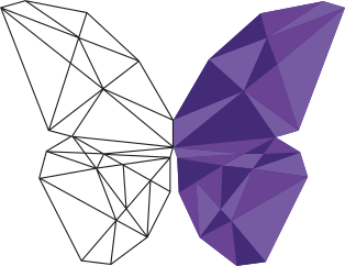
icon-light
icon-dark
icon-smallfavicon.icoThis is the rule that gets broken most often. The outline build's hairlines are the whole character of the left wing — and below roughly 200 px of logo width they stop resolving and turn into a grey smudge. The solid build exists for exactly that range.
| Situation | File | Size |
|---|---|---|
| Website header, decks, print, partner listings | logo-light / logo-dark | 200 px width and above |
| Navigation bars, email headers, signatures, banner ads | logo-small-light / logo-small-dark | 120–200 px width |
| App icon, avatar, favicon, watermark, slide corner | icon-small | 24 px and above |
| Large decorative mark, poster, hero graphic | icon-light / icon-dark | 80 px and above |
| One-colour print, embossing, embroidery, engraving | icon-light outline path | Reproduce as line art |
Absolute minimums: logo 120 px wide on screen, 30 mm wide in print; icon 24 px. Below those, use nothing rather than something illegible.
Seven variants, three formats each. SVG is the working file. The large PNG is for tools that refuse vector. The 400 px PNG is for email signatures and slide decks. Nothing zipped.
All at ci.teisenda.com/logos/, one file per link. Two further files in that folder are not logo variants: favicon.ico at 256×198 and 204.2 KB, and the AI-generated-content label AI LABELS_3x2_AI GENERATED_black.png at 2501×1668.
Never redraw any of this, and never set the wordmark in a font. It is artwork; the letterforms in these files are the only correct ones.
Reserve clear space equal to the full height of the butterfly on all four sides. Nothing enters that zone: no text, no rule, no image edge, no other logo.
Violet outline = the logo's bounding box. Dashed outline = the minimum clear space, one butterfly-height on every side.
TEISENDAThe identity leads with Teisenda Violet #432B78 — the deepest tone in our own logo. It is quieter, older and more credible than the bright violet the product interface currently leads with, and it is the reason a mid-market managing director takes us seriously.
#432B78 · violet-700The lead. Headlines on pale grounds, filled panels, print, social key visuals, chart primaries.#6A4394 · violet-600Second surface. Panel-on-panel, gradients within the violet family, secondary chart series.#765BA3 · violet-500Quiet accents, rules, dividers, section numerals, third chart series.All three are lifted directly from the logo artwork. Using them means brand and mark finally agree.
These belong to the product, not to the brand. They appear inside the app and on the website's interactive elements. They never lead a piece of communication.
#8250E6Buttons, links, focus rings, active states. Never body text on dark.#B49BF0Violet text on dark grounds. The only violet legible as type on the canvas.#D8CBF2Muted headings on dark, hairlines, disabled states.#F2EDFBTinted surfaces on paper: callouts, table stripes, quiet cards.#141020Product and web dark ground.#1E1836Cards on canvas.#FBFAFDDocuments, guides, print, decks.#1D1D1BText black. Taken from the logo file — not pure #000.One accent, used sparingly, plus two status colors that exist only in the interface. Amber is the single warm note in the system: it marks what is new, in beta or worth attention.
#EDA938"In beta", "New", highlights on dark. On paper, use #8A5B08 for text.#1E7A5ASuccess states. Interface only.#B3323AErrors and destructive actions. Interface only.| Pairing | Ratio | Verdict |
|---|---|---|
#432B78 on Paper | 11.3 : 1 | Passes AAA. The default for headlines and body on light. |
White on #432B78 | 11.3 : 1 | Passes AAA. Filled violet panels are safe at any type size. |
White on #8250E6 | 4.95 : 1 | Passes AA. Fine for button labels; do not shrink below 14 px. |
#8250E6 on Canvas | 3.8 : 1 | Fails for body text. Large headings and UI borders only. |
#B49BF0 on Canvas | 7.95 : 1 | Passes AAA. Use this whenever violet type sits on dark. |
#432B78 on Canvas | 1.7 : 1 | Never. The lead violet does not exist as type on dark. |
#432B78 to #6A4394 is the only approved pair.One family: Instrument Sans. A neo-grotesque with enough character in the R, a and t to avoid reading as a system default. Headlines use the same font as captions, set tighter, heavier, larger. Open source, self-hostable, verified against every character the 16 site languages need.
Headlines live on tight tracking. The closer the letters sit, the more the type reads as a designed object rather than default output. Below 24 px, negative tracking stops helping and starts hurting.
Body copy runs at default tracking with generous leading. This is where the family earns its keep: it handles a 70-character measure and a dense data table with the same face.
Hierarchy comes from scale and weight, not a second voice. Two available faces is how a small team picks the wrong one. If more separation is ever needed, add a text face, never a second display face.
Instrument Sans by Rodrigo Fuenzalida and Jordan Egstad, SIL Open Font License. Two variable fonts from the Google Fonts repository, unmodified. Use these rather than a static cut: one file covers 400 to 700.
Three separate files at ci.teisenda.com/fonts/, nothing zipped. Send the link, not the attachment — an agency that downloads from here gets the same file we do. The width axis sits at 100 for everything in this guide; treat anything below that as a decision, not a default.
| Role | Face | Size / line | Notes |
|---|---|---|---|
| Hero | Sans 600 | clamp 40–78 px / 1.03 | Tracking −0.042em. Max three lines. Never uppercase. |
| Section head | Sans 600 | 27–42 px / 1.06 | Tracking −0.034em. Sentence case, always. |
| Subhead | Sans 600 | 19 px / 1.30 | Tracking −0.012em. |
| Body | Sans 400 | 16 px / 1.62 | Measure 60–70 characters. Never justified. |
| Lead paragraph | Sans 400 | 19 px / 1.55 | One per section, directly under the head. |
| Label / eyebrow | Sans 600 | 10.5 px / 1.4 | Uppercase, tracking 0.19em. The only uppercase in the system. |
| UI & buttons | Sans 600 | 14 px | Sentence case. Never all caps. |
| Data | Sans 500 | — | Always font-variant-numeric: tabular-nums. |
The site runs in sixteen languages. The font files were read character by character against every accented letter those sixteen need, rather than trusting the words "Latin Extended" on a spec sheet. Shown at display weight and at body weight:
One gap. Romanian takes ș ț, comma below, U+0219 and U+021B. Both present. The cedilla forms ş ţ are not: ţ is absent, so legacy Romanian text falls back on that one letter. Convert before layout.
Punctuation localises too. German takes „…“, French « … » with hair spaces, Spanish opens a question with ¿, Polish uses „…”, and the Nordic languages take ”…”. A translated string with English quotes around it is a translated string that nobody finished.
TEISENDA is the brand. Studio Engine and Content Engine are modules of it — never standalone brands, never with logos of their own.
Studio EngineIn betaEngine pattern. New capability goes inside an existing module until there is a strategic reason it cannot.Descriptions below match teisenda.com as published. When the product moves, the site moves first and this page follows.
Four AI providers in one interface: Anthropic, OpenAI, Google, Perplexity. You switch provider mid-conversation and the history, the attachments and your instructions come along. What gets made belongs to the team rather than to one person's account.
Everything the online presence needs, built from the positioning rather than assembled from text blocks: website, landing pages, blog, lead magnets, sales material. It runs on the same foundation as the Studio Engine.
The roadmap on /ueber-teisenda names seven engines. That makes <Noun> Engine a naming system rather than two product names, and it is the reason a new module never gets an invented name of its own.
| Module | Status | Scope as published |
|---|---|---|
| Studio Engine | In beta | Multi-provider chat, projects, sharing, cost control |
| Content Engine | In development | Website, blog, SEO/AEO, landing pages |
| Data Engine | Roadmap | Enrichment, live research |
| Audience Engine | Roadmap | ICP, personas, audiences |
| Campaign Engine | Roadmap | Ads, campaigns, optimisation |
| Sales Engine | Roadmap | Offers, pricing, checkout |
| Flow Engine | Roadmap | Conversion flows, lead routing |
Only the first two carry a status label. The other five are roadmap and must be described as roadmap.
Our butterfly is built from flat triangular facets. That geometry — not a generic tech aesthetic — is the source of every graphic element we make. Constructed, angular, faceted, in violet with silver-grey.
Use as a hero ground, a slide divider, a social background, a card texture. Keep it behind a solid panel wherever type sits on top — the facets are a surface, not a stage for copy.
The particle butterfly on teisenda.com is brand property. 20,000 points trace the Temple Fay butterfly curve; the wingbeat is a travelling wave in the shader. One 14 KB file, no dependencies, no build step. Custom element: plain HTML, React, Vue, Svelte, Astro.
A flat violet panel above means the component switched itself off. It does that under reduced-motion, data-saver, slow connections, and on devices under 4 GB RAM or four cores. Intended: it is decoration, and it yields.
Load once, then place the element. It fills its nearest positioned box, so the parent needs position:relative and a height.
<!-- once per page -->
<script src="https://ci.teisenda.com/effects/butterfly-field.js" defer></script>

<!-- then wherever it belongs -->
<section style="position:relative;min-height:100vh">
  <butterfly-field style="position:absolute;inset:0"
    gradient="#2C1B52,#1E1836,#141020"
    color-deep="#2C1B52"
    color-primary="#8250E6"
    color-lavender="#D8CBF2"></butterfly-field>

  <h1 style="position:relative">Your headline</h1>
</section>
These four colour values are the brand configuration, the only one approved for outward-facing work. Omit gradient and the particles draw over the existing CSS background. Everything else has a default.
| Attribute | Default | What it does |
|---|---|---|
| gradient | none | Three hex values, top to bottom, painted behind the particles. Omit for transparent. |
| color-deep | #3A2C63 | Body tone. Brand value is #2C1B52. |
| color-primary | #8250E6 | Wing tone. Already the brand value. |
| color-lavender | #D8CBF2 | Tip tone. Already the brand value. |
| count | 20000 / 7000 | Particles. The lower figure applies below 900 px viewport width. |
| intensity | 0.7 | Brightness. Lower it until type on top stays readable. |
| glow | 0.25 | Flare on each wingbeat. |
| size | 13 | Point size. |
| materialize | 1.8 | Assembly time in seconds on load. 0 turns it off. |
| fps | 30 | Frame rate. |
| height | 0 | Vertical position in world units. Positive sits higher. |
| parallax | on | parallax="off" drops the mouse response. |
| force | — | Overrides the self-disabling above. Use it for a screenshot, never in production. |
| debug | — | Logs failures. Without it the effect fails silently. |
Three files, nothing zipped. Link the component from here and every site stays on one version.
2035 icons from Lucide 1.34.0 under the ISC licence, unmodified. They are not a new decision: the icons already on teisenda.com carry exactly this profile — 24×24, fill:none, stroke-width:2, round caps and joins.
138 of them are grouped for the work we actually do — the Curated chip and the eleven beside it narrow the list to those. Each card copies its SVG source or downloads the file. Machine-readable index: /icons/index.json — name, group and byte size for all 2035.
Nothing matches that word.
The stroke is currentColor. There is nothing to recolour: set color and the icon follows, which is why an icon never carries a hex value of its own. That only works when the SVG is part of the page — paste the markup, or use the file as a CSS mask. Loaded through <img src> the file is a document of its own, currentColor finds no context and the icon renders black. The grid above uses the mask route, which is why these icons take the colour of their card.
/* the icon takes the colour of its context */
.icon{ width:20px; height:20px; stroke-width:2; }

/* default on dark */
.icon        { color:#B49BF0; }
/* a signal, and only where something needs attention */
.icon--alert { color:#EDA938; }
/* inside a violet button the icon is simply white */
.btn .icon   { color:#fff; }

/* the mask route: an external file that still takes its colour */
.icon--file{ width:20px; height:20px; background-color:currentColor;
             -webkit-mask:url("/icons/brain.svg") center/contain no-repeat;
                     mask:url("/icons/brain.svg") center/contain no-repeat; }
stroke-width at 2. The whole set is drawn for it. A thinner stroke at 16 px looks refined in isolation and falls apart in a row of icons.aria-hidden="true". An icon that carries meaning on its own gets a label instead.#8250E6 as icon colour on the dark canvas. It clears the 3:1 for a control, and an icon is closer to text — use #B49BF0.271 flags as SVG, 249 of them ISO countries and the rest regions and organisations such as the EU, the UN, England and Scotland. Original artwork with the coats of arms intact, in 4:3 and 1:1. From flag-icons 7.5.0 under the MIT licence, unmodified — LICENSE.txt ships with them.
Machine-readable index: /flaggen/index.json — code, name, continent and byte sizes for all 271. The grid is rendered from it.
Nothing matches that word.
Every card copies its SVG source and downloads both ratios. Sizes run from 178 bytes for Indonesia to 177 KB for Serbia, which is the whole argument for referencing a file rather than pasting markup: <img src="/flaggen/4x3/de.svg" class="flag" alt=""> keeps a flag one file across every surface. Set weight: 1.9 MB for 4:3, 1.9 MB for 1:1.
Without this the SVG fills its container. flex:none is a guard: flags sit in flex rows, and a flex item with the default flex-shrink:1 gets squeezed out of ratio when the row runs tight. A square flag such as Switzerland shows it first.
.flag{ height:15px; width:auto; flex:none;
       border-radius:2px; display:inline-block; vertical-align:-3px;
       box-shadow:0 0 0 1px rgba(255,255,255,.14); }
15 px is the production size and the cards above show 26 px so the drawing is legible. The 1 px white glow replaces a border: without it a white flag such as Finland or Poland has no edge on a dark ground, and a stroke inside the artwork would be wrong.
Deutsch, not with a German flag: Austria and Switzerland speak it too.105 images from teisenda.com, two downloads each: original PNG, and WebP at 1600 px. Use WebP in pages and decks, PNG for editing, print and resampling. The filter searches headline, filename and topic, German and English.
Machine-readable index: /bilder/index.json — slug, headline, keywords and byte sizes for all 105. The grid below is rendered from it.
Nothing matches that word.
Set weight: 188.8 MB as PNG, 3.1 MB as WebP, 61× lighter. Flat gradients are what PNG handles worst and WebP best. Send the WebP unless somebody needs the PNG. Thumbnails are 400 px WebP, loaded on scroll, 429 KB in total.
butterfly-field. Ours earns its particles by drawing the mark. Star dust, drifting dot clouds and floating sparks draw nothing, and they are the most recognisable generated-website element there is.This is the section that matters most. We sell content that doesn't read as generated — so our own copy has to survive the test we're asking customers to apply. Right now it doesn't.
We have run agencies, sat in the seat, missed the deadline. We write like someone who has done the work, not someone who has read about it.
"Four AI providers in one interface" beats "cutting-edge multi-model orchestration". Name the tool, the number, the hour.
Beta means beta. In development means not built yet. Admitting a limit is the cheapest credibility available to us.
Rhythm is what separates written from generated. Vary sentence length on purpose. Let one sentence run long, then stop.
Measured, not aspirational. Read off four published pages of teisenda.com — home, both module pages, about. 115 sentences. Adjectives ("clear, confident, human") give a writer nothing to check a draft against; these numbers do.
Mean 13.8 words against a median of 11, range 3 to 75. That gap is the voice. Mean and median sitting on top of each other means levelled-out rhythm, the most reliable tell of generated prose.
"Anthropic, OpenAI, Google und Perplexity", not "leading AI providers". "CRM, CMS, Website, Ads-Kampagnen" rather than "your entire stack". A named thing can be checked; a category cannot.
"Drei Handgriffe, die heute vier Browserfenster und einen Kopiervorgang kosten." The pain is a window count and a paste, not "inefficiency" or "friction".
"Du schreibst deine Frage in ein Feld." The reader does the verb. Passive constructions and nominalisations are where product copy goes to die.
"Es gibt weder einen Termin noch eine Buchung." And on model names: "sie stünden hier schneller falsch als richtig." Naming what is missing is the cheapest credibility available.
"Zwei Module, ein System." "So arbeitest du damit." The full stop is a house habit and it is what stops a headline reading like a slogan.
"Wachstum, das sich unfair anfühlt" is an abstract selling itself, and 13% of sentences use a dash as a beat. Both are on the list further down this page. The guide describes the target, and the site has not fully arrived.
16 site languages. Address form is decided per language, not per brand: nine familiar, seven formal. Order below matches the language menu on teisenda.com.
| Language | Address | Note |
|---|---|---|
| Deutsch | du | Consistent across the whole brand, including sales material and the cover note on an invoice. Never switch to Sie mid-funnel. |
| English | you | British spelling. "Organisation", "optimise", "colour". |
| Français | vous | French B2B does not tutoyer a stranger. Informality reads as careless rather than friendly. |
| Español | tú | Peninsular Spanish. Not usted, not vos. |
| Italiano | Lei | Capitalised, third person. tu belongs to consumer apps; an Italian managing director expects otherwise. |
| Português | você | Brazilian Portuguese unless a client specifies European. |
| Polski | Pan / Pani | With the third-person verb. Polish offers no neutral middle ground, and ty to a stranger lands as an insult. |
| Nederlands | je | Dutch business dropped the formal register decades ago. Switch to u only when a client writes it first. |
| Română | dumneavoastră | Formal throughout, including subject lines. tu is for friends. |
| Svenska | du | Universal since the du-reform of the sixties. ni sounds archaic at best and sarcastic at worst. |
| Čeština | vy | Vykání is the business default. Capitalise Vy when writing to one person. |
| Dansk | du | De survives in royal address and nowhere else. |
| Norsk bokmål | du | As in Danish and Swedish. De is out of use. |
| Suomi | sinä | Finland dropped formal address in everyday business. te now reads as distance, not respect. |
| Magyar | Ön | Formal, third person. te is for people you already know. |
| Hrvatski | Vi | Capitalised when writing to one person. |
The chosen form holds for every asset in that language: ads, landing pages, email, onboarding, invoices. Never mix registers inside one language. Sie in an ad and du on the page reads as nobody being in charge.
Each of these appears on teisenda.com today. Individually they are fine. Together, in the same rhythm, across every section, they are the signature of generated copy — and a reader who has seen a hundred AI landing pages recognises it in about four seconds.
"Two modules, one system."
The antithetical pair. Symmetrical, quotable, and the single most over-produced sentence shape in AI copy.
"Two modules. They share the same brand profile, so what you write in one shows up correctly in the other."
Says what "one system" actually buys the reader.
"One works with you, the other works for you."
The mirrored preposition. Elegant, empty, and immediately familiar.
"In the Studio Engine you're in the chat. The Content Engine runs without you and hands back finished pages."
Two concrete situations instead of one clever line.
"Growth that feels unfair."
Borrowed from a decade of SaaS taglines. It also promises something we can't evidence.
"Marketing output that used to need three freelancers."
A claim a managing director can price.
„Zu viele Werkzeuge, zu wenig Zeit."
German, from the current homepage. The three-beat parallel construction — same shape, same length, same rhythm — used in every section heading.
„Sieben Tools, ein Marketer, und das Whitepaper liegt seit März rum."
Same insight, but it sounds like it came from a specific person's week.
set up · run · hand back · in your tone of voice · brand profile · module · agent · finished page · in beta · in development · mid-market · in five languages · in under three hours
solution (unqualified) · seamless · holistic · cutting-edge · AI-powered · next-generation · game-changer · unlock · elevate · supercharge · unfair advantage · 10× · effortless · revolutionary
One exception worth defending: "Growth Solution" is in the company name. Leave it there. Do not let the word spread into body copy.
The same system across the places it actually shows up. Dark canvas for the product and the web, paper for documents and print.
Four AI providers in one interface, a brand profile both modules read from, and finished pages in five languages. The Studio Engine is in beta now.
Hero at 600 with tight tracking, deck at 400, one violet button. No particles, no gradient text, no mid-sentence colour change.
Seven tools, one marketer, and the whitepaper has been sitting there since March.
teisenda.comPrimary logo, Instrument Sans, no image banner, no quote, no social icon row.
Paste this into the stylesheet and the identity is enforced in code rather than in review comments.
/* TEISENDA — brand tokens v1.0 */
:root{
  /* brand — lead with these */
  --v-700:#432B78; /* Teisenda Violet — the lead */
  --v-600:#6A4394; --v-500:#765BA3;

  /* interface only — never the face of the brand */
  --v-400:#8250E6; /* buttons, links, focus */
  --v-300:#B49BF0; /* violet type on dark */
  --v-100:#D8CBF2; --v-050:#F2EDFB;

  /* grounds */
  --canvas:#141020; --surface:#1E1836; --raised:#2A2145; --dark-border:#3A3255;
  --paper:#FBFAFD; --ink:#1D1D1B;

  /* signal */
  --amber:#EDA938; --amber-ink:#8A5B08; --jade:#1E7A5A; --critical:#B3323A;

  /* type */
  --font:"Instrument Sans", system-ui, sans-serif;  /* one family, two registers */
  --track-hero:-.042em; --track-head:-.034em; --track-sub:-.012em; --track-body:0;
}
The browser draws the scrollbar, and left alone it draws grey. On #141020 that grey belongs to nobody. Every TEISENDA surface sets it, this page included.
/* Two syntaxes, because both are needed. scrollbar-color covers Firefox and
   Chrome from 121; ::-webkit-scrollbar covers the rest. Where an engine
   understands scrollbar-color it ignores the WebKit rules. Both routes reach
   the same violet, and scrollbar-color inherits, so it applies in every
   nested scroll area without further work. */
html{ scrollbar-color: #8250E6 #1E1836; }

::-webkit-scrollbar       { width:13px; height:13px; }
::-webkit-scrollbar-track { background:#1E1836; }
::-webkit-scrollbar-thumb { background:#8250E6; border-radius:99px;
                            border:3px solid #1E1836; }
::-webkit-scrollbar-thumb:hover { background:#B49BF0; }
::-webkit-scrollbar-corner{ background:#1E1836; }
Thumb is #8250E6, not the logo violet. Against the canvas #432B78 reaches 1.63:1 and disappears; #8250E6 reaches 3.75:1 and clears the 3:1 WCAG asks of an interface control. #8250E6 is barred as text on dark and correct as a control.
Any panel with its own scroll area inherits the colour and only needs scrollbar-width: thin if a narrower bar suits it better.
Self-host as woff2 under /fonts/, replacing the current Space Grotesk and Inter files. Weights 400, 500, 600, 700 plus italic 400. Subset latin + latin-ext. Point --font-display and --font-body at it, apply the tracking variables to the heading levels.